
 EN




A well-designed thank you sticker serves as more than just a label—it's a tangible expression of gratitude that leaves a lasting impression on customers and partners. The visual appeal of a thank you sticker directly influences how recipients perceive your brand, making design choices critically important. From color psychology to typography, every element contributes to the overall effectiveness and memorability of your thank you sticker.
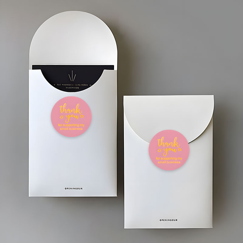
Creating an impactful thank you sticker requires understanding how design principles work together to capture attention and communicate sincerity. Whether you're using thank you sticker designs for product packaging, corporate gifts, or customer appreciation initiatives, the visual elements you choose will determine whether your sticker stands out or blends into the background. This guide explores the essential design components that transform a basic thank you sticker into a powerful brand touchpoint.
Color Theory and Emotional Impact
Choosing Colors for Your Thank You Sticker
Color psychology plays a fundamental role in shaping how recipients respond to your thank you sticker. Warm colors like gold, orange, and red convey warmth and appreciation, while cool colors such as blue and green suggest trust and professionalism. The right color palette for your thank you sticker depends on your brand identity and the message you want to communicate. Thank you sticker designs that incorporate complementary color combinations create visual harmony and make the label more aesthetically pleasing.
Color Contrast and Readability
High contrast between the background and text ensures your thank you sticker remains readable at any size. A thank you sticker with poor contrast may appear muddy or difficult to read when scaled down for small applications. Testing your thank you sticker color scheme against various backgrounds helps identify potential readability issues before production. Professional thank you sticker designs often use a primary color for visual impact paired with neutral tones that don't overwhelm the message or create visual noise.
Typography and Font Selection
Typeface Personality and Brand Alignment
The font you select for your thank you sticker communicates volumes about your brand personality. Serif fonts project tradition and elegance, making them ideal for luxury or corporate thank you sticker applications. Sans-serif fonts convey modernity and clarity, working well for contemporary thank you sticker designs aimed at younger audiences. Script or handwritten fonts add a personal touch to thank you sticker labels, suggesting individual attention and warmth. Your thank you sticker typography should align seamlessly with your overall brand identity while remaining legible even when printed at smaller dimensions.
Size Hierarchy and Visual Balance
Establishing clear size hierarchy within your thank you sticker ensures the most important message stands out immediately. The words 'thank you sticker' or primary message should dominate, with supporting text scaled proportionally smaller. Visual balance prevents your thank you sticker from appearing cluttered or unorganized, maintaining a professional appearance that reflects your brand quality. Proper spacing between text elements in a thank you sticker design allows each component to breathe, creating an organized and intentional layout that enhances overall visual appeal.
Imagery, Icons, and Decorative Elements
Strategic Icon and Illustration Selection
Visual elements like icons, illustrations, or subtle patterns elevate a thank you sticker from basic to memorable. Icons should directly relate to your message and industry—floral designs work well for beauty and wellness thank you sticker products, while geometric patterns suit tech and modern brands. A well-chosen icon in your thank you sticker design provides visual interest without overwhelming the text or creating confusion. Thank you sticker designs benefit from simple, clean illustrations rather than complex artwork that becomes indistinct when reproduced at small scales.
Minimalism Versus Detail in Thank You Sticker Design
The minimalist approach to thank you sticker design emphasizes clean lines, ample white space, and essential elements only. This style projects sophistication and allows the 'thank you' message to command full attention on your thank you sticker. Conversely, detailed or ornate thank you sticker designs appeal to brands prioritizing luxury and artisanal positioning. Thank you sticker effectiveness doesn't require excessive detail—strategic use of one or two visual elements creates maximum impact while maintaining professional aesthetics. Consider your audience and brand positioning when deciding whether your thank you sticker should embrace minimalism or incorporate richer visual detail.
Material and Finish Considerations
Texture and Tactile Appeal
The material finish of your thank you sticker significantly impacts perceived quality and visual appeal. A matte finish on a thank you sticker provides a sophisticated, subdued appearance that appeals to premium brands, while glossy finishes create vibrant, eye-catching visual impact. The choice between matte and glossy finishes for your thank you sticker affects how colors appear and how light reflects off the label. Eco-friendly thank you sticker materials like PET and recycled paper add environmental credibility while maintaining aesthetic appeal that resonates with conscious consumers.
Die-Cut Shapes and Format
Custom die-cut shapes transform your thank you sticker from a standard rectangle into a distinctive branded element. Circular thank you sticker designs work well for versatile applications and create a softer, more approachable aesthetic. Unique thank you sticker shapes that echo your logo or brand identity strengthen visual recognition and brand recall. The shape of your thank you sticker can be a major design differentiator—while standard formats ensure practicality, thank you sticker options that incorporate custom dimensions or die-cut designs create memorable unboxing experiences that recipients share on social media.
Layout Principles and Composition
Symmetry and Visual Hierarchy in Thank You Sticker Design
Strategic layout decisions determine whether your thank you sticker achieves professional polish or appears haphazard. Centered layouts convey formality and balance, working well for corporate thank you sticker applications. Off-center compositions with asymmetrical balance create dynamic energy suitable for creative or lifestyle thank you sticker designs. The visual hierarchy in your thank you sticker should guide the viewer's eye naturally from the primary message through supporting details without confusion. Consistency in layout across multiple thank you sticker variations reinforces brand recognition and creates cohesive product packaging aesthetics.
Whitespace and Visual Clarity
Strategic use of whitespace in your thank you sticker design prevents visual overload and emphasizes key messages. Generous whitespace around your thank you sticker text and imagery creates breathing room that improves readability and perceived quality. Dense, cramped thank you sticker designs appear unprofessional and difficult to process, regardless of individual element quality. The principle of 'less is more' applies powerfully to thank you sticker design—restraint and intentionality create stronger visual impact than attempting to include every possible design element. Professional thank you sticker examples consistently demonstrate that white or neutral space is as important as filled areas in achieving visual excellence.
FAQ
What color combination works best for thank you sticker designs across different industries?
Color selection for your thank you sticker should align with industry norms and your target audience expectations. Luxury and premium brands often use gold, navy, or deep jewel tones in thank you sticker designs, while eco-conscious companies favor natural greens and earth tones. Tech companies typically employ bold, modern color combinations in their thank you sticker designs, while traditional sectors prefer classic combinations like cream and black. Testing your thank you sticker color palette with actual audience feedback ensures it resonates appropriately.
How can I ensure my thank you sticker design remains readable when printed small?
Test your thank you sticker design at actual production size before committing to print runs. Ensure your thank you sticker font size never drops below 8–10 points for body text, with main headings significantly larger. Avoid thin fonts or complex serifs in thank you sticker designs, as these become illegible when reduced. High contrast backgrounds in your thank you sticker ensure text clarity regardless of size, and limiting your thank you sticker to three or fewer font sizes maintains visual hierarchy and readability.
Should custom die-cut shapes always be used in thank you sticker designs?
While custom shapes add uniqueness, they're not mandatory for successful thank you sticker designs—your thank you sticker effectiveness depends more on overall design quality and brand alignment. Standard shapes offer cost advantages and practical benefits for thank you sticker applications, while custom shapes create premium positioning if your budget allows. Consider your brand positioning and intended thank you sticker use when deciding whether custom die-cutting adds sufficient value to justify increased production costs.