


The visual impact of a custom logo sticker determines whether your brand captures attention or fades into the background. In competitive B2B and retail environments, the difference between a forgettable label and a memorable brand touchpoint often comes down to deliberate design choices that leverage color psychology, material properties, dimensional depth, and strategic placement. Understanding which design elements amplify the visual presence of a custom logo sticker allows businesses to transform simple adhesive labels into powerful marketing assets that reinforce brand identity at every customer interaction point.
Visual impact extends beyond mere aesthetics to encompass functional communication, tactile engagement, and psychological resonance with target audiences. For industrial packaging, retail product labeling, and promotional applications, the custom logo sticker serves as a micro-billboard that must convey brand values, quality standards, and product differentiation within seconds of visual contact. This article examines the specific design elements that enhance sticker visual impact through a systematic analysis of color dynamics, typographic hierarchy, finishing techniques, dimensional effects, and compositional strategies that professional designers and brand managers deploy to maximize shelf presence and brand recall.
Color Strategy and Contrast Optimization
Psychological Impact of Color Selection
Color choices in custom logo sticker design directly influence emotional response and brand perception before any text is read or imagery processed. High-contrast color combinations such as black on white, navy on gold, or red on neutral backgrounds increase legibility from distance and accelerate recognition in cluttered visual environments. The psychological associations tied to specific hues must align with brand positioning, where technology brands often leverage blue tones for trust and reliability, while organic product lines emphasize earth tones to communicate natural authenticity. Color temperature also affects perceived brand personality, with warm palettes suggesting approachability and energy while cool palettes convey professionalism and calm authority.
Contrast Ratios and Visual Hierarchy
Effective custom logo sticker designs maintain minimum contrast ratios of four-point-five to one between foreground and background elements to ensure readability across varying lighting conditions and viewing distances. This technical standard becomes particularly critical for small-format stickers where reduced physical size demands higher contrast to maintain visual clarity. Strategic use of contrasting colors guides the viewer's eye through a predetermined visual hierarchy, directing attention first to the logo mark, then to supporting text, and finally to supplementary design elements. Dark backgrounds with metallic or fluorescent accents create premium positioning, while light backgrounds with bold accent colors communicate accessibility and openness.
Color Consistency Across Production Methods
Maintaining color fidelity between digital design files and physical custom logo sticker output requires understanding the limitations and capabilities of different printing technologies. Pantone Matching System specifications ensure consistent brand colors across offset, digital, and flexographic printing methods, preventing the brand dilution that occurs when logo colors shift between production runs. Metallic inks, spot varnishes, and specialized color formulations extend the visual palette beyond standard CMYK capabilities, enabling designers to create distinctive appearances that competitors cannot easily replicate. Color proofing protocols should account for substrate properties, as the same ink formulation appears differently on matte paper, glossy vinyl, or transparent film materials.
Typographic Precision and Readability Engineering
Font Selection for Maximum Legibility
Typography in custom logo sticker applications demands fonts that maintain structural integrity at reduced sizes while conveying appropriate brand personality. Sans-serif typefaces generally outperform serif alternatives in small-format applications due to cleaner letterforms that resist visual degradation when printed at six-point sizes or smaller. Custom lettering and proprietary typefaces differentiate premium brands from commodity competitors, though these specialized fonts must undergo rigorous testing to ensure production viability across multiple substrate types and printing methods. Weight variation within a font family allows designers to establish clear information hierarchy without introducing additional typefaces that might create visual confusion.
Spacing and Kerning Optimization
Letter spacing adjustments significantly impact the readability and perceived quality of text elements within a custom logo sticker design. Tighter kerning creates compact, contemporary appearances suitable for technology and fashion brands, while generous spacing suggests luxury and exclusivity. Line spacing in multi-line text blocks must balance information density with visual breathing room, typically maintaining leading values between one-point-two and one-point-five times the font size. Tracking adjustments compensate for optical challenges introduced by metallic or embossed finishes, which can reduce apparent letter spacing through dimensional shadow effects and reflective properties that blur character boundaries.
Typographic Hierarchy and Information Architecture
Establishing clear typographic hierarchy guides viewer attention through the informational content of a custom logo sticker in deliberate sequence. Primary information such as brand names typically employs the largest, boldest type treatments, followed by product names or category descriptors in secondary sizes, with technical specifications or compliance information rendered in the smallest acceptable sizes. Typographic contrast through size variation should follow the rule of thirds, where secondary text elements appear approximately sixty-five percent of the primary text size to maintain visual distinction without creating jarring size jumps. Alignment choices between centered, left-aligned, or justified text affect overall composition balance and should support rather than compete with logo imagery.
Dimensional Effects and Surface Manipulation
Embossing and Debossing Techniques
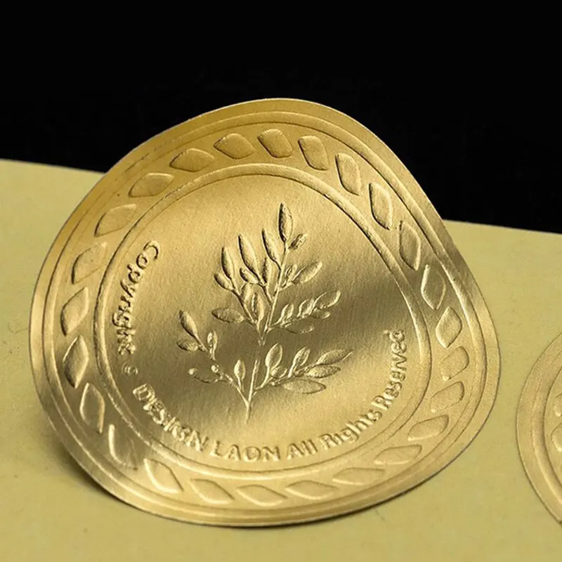
Three-dimensional surface manipulation transforms flat custom logo sticker designs into tactile experiences that engage multiple senses and communicate premium positioning. Blind embossing creates raised patterns without ink, producing subtle sophistication through light and shadow play that changes with viewing angle. Registered embossing aligns dimensional effects with printed imagery, adding depth to logo marks or creating button-like interactive elements that invite touch. The dimensional height of embossed elements typically ranges from point-zero-one to point-zero-five inches, with deeper impressions requiring heavier substrate weights to prevent material rupture and maintain structural integrity through handling and application.
Foil Stamping and Metallic Finishes
Metallic foil application elevates custom logo sticker visual impact through reflective surfaces that capture ambient light and create dynamic appearances under varying illumination conditions. Hot foil stamping transfers thin metallic films onto paper and film substrates through heat and pressure, producing mirror-like finishes unavailable through conventional printing inks. Holographic foils add security features and visual complexity through diffractive patterns that shift color with viewing angle, deterring counterfeiting while creating premium aesthetic appeal. Cold foil processes expand metallic finishing capabilities to high-speed digital printing platforms, democratizing access to reflective effects previously limited to offset production environments with specialized equipment.
Texture and Tactile Engagement
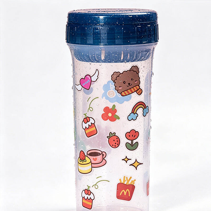
Surface texture in custom logo sticker design extends beyond visual perception to create memorable tactile experiences that strengthen brand recall through multi-sensory engagement. Soft-touch coatings deliver velvety surfaces that suggest luxury and quality, while textured varnishes simulate materials ranging from leather grain to linen weave. Spot UV applications create contrast between matte and glossy surface areas within a single sticker, enabling designers to highlight specific elements such as logo marks while maintaining subdued backgrounds. Raised UV printing builds dimensional text and graphics through multiple varnish layers, achieving embossed effects without mechanical die-cutting processes that increase production complexity and minimum order quantities.
Compositional Balance and Spatial Organization
Negative Space Utilization
Strategic use of negative space within custom logo sticker composition prevents visual overcrowding while directing attention to priority elements through deliberate emptiness. White space surrounding logo marks creates visual breathing room that enhances legibility and prevents the cramped appearance common in designs attempting to maximize information density within limited sticker dimensions. The principle of active white space treats empty areas as intentional design elements rather than unused portions of the layout, using spatial relationships to create implied connections between disparate visual elements. Minimum clear space specifications around logo marks, typically defined as a percentage of the logo height, protect brand identity from visual competition with adjacent elements on packaging or product surfaces.
Proportional Relationships and Golden Ratio
Mathematical proportions derived from the golden ratio create inherently pleasing spatial relationships within custom logo sticker layouts that resonate with human visual perception preferences. Dividing sticker dimensions according to one-point-six-one-eight ratios produces balanced compositions where primary and secondary elements occupy spaces that feel naturally harmonious rather than arbitrarily sized. Grid-based layout systems ensure consistent spatial relationships between repeating elements across sticker families and product lines, maintaining brand coherence while allowing variation in specific content. Rule-of-thirds composition places focal points at intersection points one-third from sticker edges, creating dynamic tension that engages viewers more effectively than centered symmetrical arrangements.
Border Treatment and Edge Definition
Border elements in custom logo sticker design serve both functional and aesthetic purposes, containing compositional elements while creating finishing touches that signal quality and attention to detail. Die-cut borders following logo contours eliminate rectangular backgrounds, allowing custom-shaped stickers to integrate seamlessly with product packaging and branded materials. Decorative border patterns ranging from simple line weights to complex ornamental frameworks establish style consistency across product lines while providing visual containment for internal elements. Border weight should scale proportionally with overall sticker dimensions, with thicker borders on larger formats and delicate hairlines on small-format applications to maintain appropriate visual balance.
Material Selection and Substrate Properties
Vinyl Versus Paper Substrates
Material choice fundamentally affects the visual characteristics and performance capabilities of custom logo sticker applications. Vinyl substrates offer superior durability and weather resistance for outdoor applications, with glossy finishes that enhance color saturation and visual vibrancy. Paper-based materials provide matte surfaces that reduce glare and create sophisticated appearances suitable for premium packaging applications where tactile quality communicates brand values. Clear vinyl substrates enable no-label looks where printed elements appear to float directly on product surfaces without visible backing material, creating clean contemporary aesthetics particularly effective for glass and transparent packaging applications.
Finish Options and Surface Properties
Surface finish selection dramatically impacts how custom logo sticker designs interact with ambient light and how colors appear under different viewing conditions. Gloss finishes maximize color saturation and create vibrant appearances that attract attention in retail environments, though they introduce glare that can reduce readability under direct lighting. Matte finishes eliminate reflective glare while producing sophisticated subdued appearances that suggest premium positioning and quality craftsmanship. Satin finishes occupy the middle ground between gloss and matte properties, offering moderate color enhancement with reduced glare compared to high-gloss alternatives. Textured finishes ranging from linen to canvas patterns add visual interest and disguise fingerprints and minor surface imperfections that become visible on smooth glossy surfaces.
Adhesive Properties and Application Surfaces
Adhesive formulation affects both the functional performance and aesthetic appearance of custom logo sticker applications across diverse substrate types and environmental conditions. Permanent adhesives create strong bonds suitable for product labeling and branding applications where sticker removal is not anticipated, while removable adhesives enable repositioning and temporary applications without leaving residue. High-tack adhesives accommodate challenging surfaces including low-surface-energy plastics, textured materials, and slightly curved or irregular surfaces common in industrial packaging. Adhesive coverage patterns including full coverage, pattern coating, and edge-only application affect sticker opacity and appearance when applied to transparent or colored surfaces, with full coverage providing maximum opacity to prevent show-through of underlying surface colors.
FAQ
What is the optimal size range for maintaining custom logo sticker visual impact?
The optimal size for custom logo sticker visual impact depends on viewing distance and application context, though minimum dimensions of one inch by one inch generally maintain legibility for logo marks and supporting text. Larger formats between two and four inches square maximize shelf presence for retail packaging applications, while smaller formats below one inch require simplified designs eliminating fine details that cannot reproduce reliably at reduced scales. The viewing distance principle suggests sticker dimensions should equal approximately one-tenth of the typical viewing distance, meaning products viewed from three feet benefit from stickers measuring approximately three to four inches to ensure immediate brand recognition.
How many colors should be included in custom logo sticker designs for maximum impact?
Effective custom logo sticker designs typically limit color palettes to three or four distinct hues to maintain visual clarity and production cost efficiency. Single-color designs with strategic use of substrate color as background create bold high-contrast appearances particularly effective for industrial and technical applications. Two-color combinations enable accent strategies where primary brand colors dominate while secondary colors highlight specific elements or create depth through tonal variation. Designs exceeding five distinct colors risk visual confusion and increased production costs, though gradient effects and photographic imagery may require full-color process printing to achieve intended visual results.
Which finishing techniques provide the best return on investment for premium positioning?
Spot UV coating delivers exceptional return on investment for premium custom logo sticker positioning by creating dramatic contrast between matte and glossy surface areas at relatively modest cost increases compared to metallic foiling or embossing. Selective application to logo marks or key text elements produces striking visual effects that communicate quality without the setup costs associated with foil dies or embossing plates. For maximum premium impact with budget flexibility, combining spot UV with matte lamination creates sophisticated two-level surface treatments, while adding single-color foil accents to spot UV designs produces luxury positioning comparable to fully foiled alternatives at fraction of the production cost.
How does custom logo sticker shape affect visual recognition and brand recall?
Custom die-cut shapes increase brand recognition by twenty to thirty percent compared to standard rectangular formats by creating distinctive silhouettes that register in peripheral vision before detailed design elements become visible. Shapes echoing logo geometry or product forms strengthen brand association and improve recall through visual repetition across touchpoints. Circular and oval shapes suggest completeness and unity while occupying visual space efficiently, though complex irregular shapes may increase production costs through specialized die requirements and material waste. Shape selection should balance distinctiveness with production practicality, avoiding intricate cutouts below point-one-two-five inch dimensions that challenge die-cutting precision and increase application difficulty.
Table of Contents
- Color Strategy and Contrast Optimization
- Typographic Precision and Readability Engineering
- Dimensional Effects and Surface Manipulation
- Compositional Balance and Spatial Organization
- Material Selection and Substrate Properties
-
FAQ
- What is the optimal size range for maintaining custom logo sticker visual impact?
- How many colors should be included in custom logo sticker designs for maximum impact?
- Which finishing techniques provide the best return on investment for premium positioning?
- How does custom logo sticker shape affect visual recognition and brand recall?